# Modal
The modal component displays a modal on screen and can be populated with variation of content combinations.
NOTE
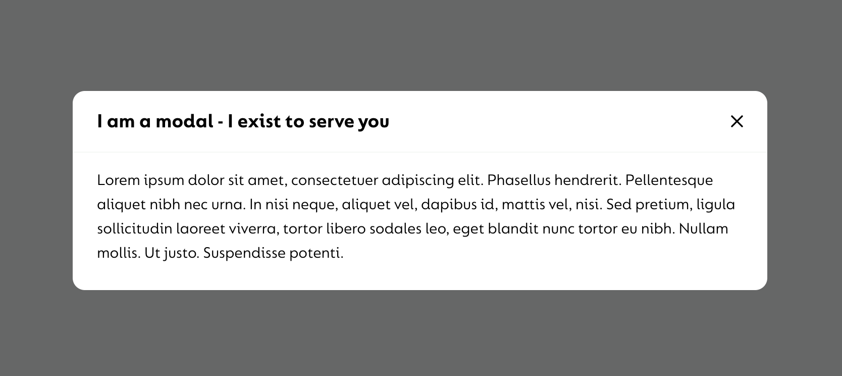
Given the nature of the modal component. This page includes screen shots, rather than live editable examples.
# Default
The below is the bare bones html for the modal. Just swap out the content inside the goco-c-modal__main container for whatever html you'd like to display within the modal.
<div class="goco-c-modal goco-c-modal--active">
  <div class="goco-c-modal__dialog">
    <div class="goco-c-modal__content">
      <button class="goco-c-modal__close-button" tabindex="0">
        <svg
          class="goco-c-modal__close-icon goco-c-icon"
          xmlns="http://www.w3.org/2000/svg"
          width="20"
          height="20"
          viewBox="0 0 24 24"
          fill="none"
          stroke="currentColor"
          stroke-width="2"
          stroke-linecap="round"
          stroke-linejoin="round"
        >
          <line x1="18" y1="6" x2="6" y2="18"></line>
          <line x1="6" y1="6" x2="18" y2="18"></line>
        </svg>
      </button>
      <div class="goco-c-modal__header">
        <p class="goco-c-modal__title">Modal title goes here</p>
      </div>
      <div class="goco-c-modal__main">
        <p style="margin: 0;">
          This paragraph tag can be swapped out for watever content you'd like to display.
        </p>
      </div>
    </div>
  </div>
</div>
# Example Screenshot

# Modal Behaviour
On mobile devices, the modal will be fixed to the bottom of the viewport screen so users can still see some of the content above.
On wider devices from 1024px and above, the modal will display in the center of the viewport with the dark grey overlay covering all other content on the screen.
# Modals with buttons
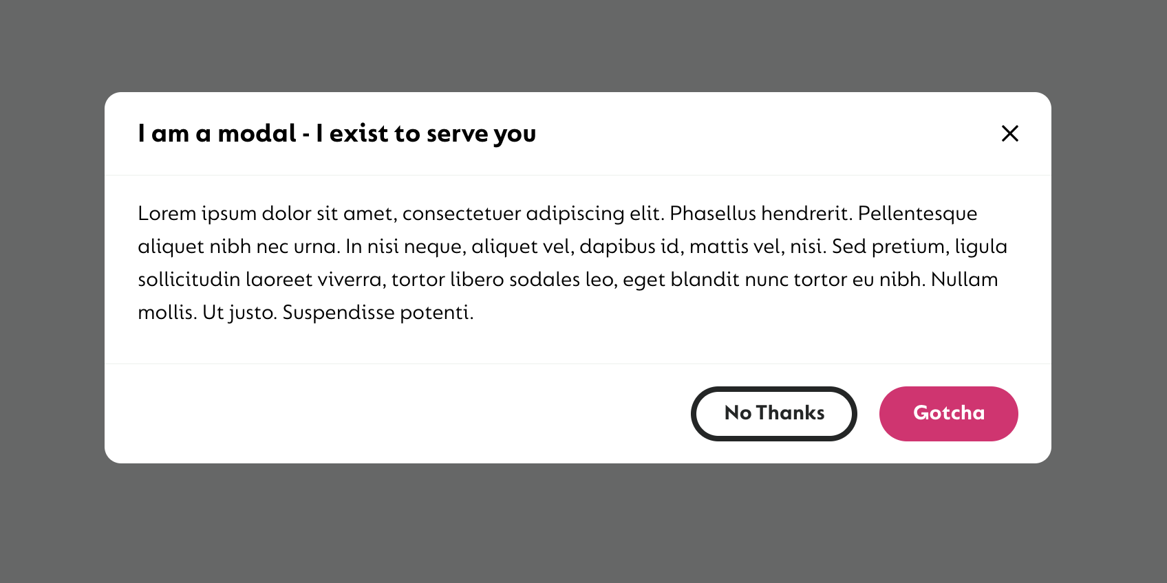
The modal has an optional footer section that can be populated with up to two buttons, a primary and a secondary.
NOTE
The primary button should always be used if there is only ever one button to use on the modal. If there two buttons, the primary button should be used for primary user actions such as 'Submit', 'Confirm', 'Accept' and 'Take me there' etc. The secondary button should be used for the oppsite such as 'Cancel', 'Close', 'Back' and 'No thanks' etc.
# Example
<div class="goco-c-modal goco-c-modal--active">
  <div class="goco-c-modal__dialog">
    <div class="goco-c-modal__content">
      <button class="goco-c-modal__close-button" tabindex="0">
        <svg
          class="goco-c-modal__close-icon goco-c-icon"
          xmlns="http://www.w3.org/2000/svg"
          width="20"
          height="20"
          viewBox="0 0 24 24"
          fill="none"
          stroke="currentColor"
          stroke-width="2"
          stroke-linecap="round"
          stroke-linejoin="round"
        >
          <line x1="18" y1="6" x2="6" y2="18"></line>
          <line x1="6" y1="6" x2="18" y2="18"></line>
        </svg>
      </button>
      <div class="goco-c-modal__header">
        <p class="goco-c-modal__title">Modal title goes here</p>
      </div>
      <div class="goco-c-modal__main">
        <p style="margin: 0;">
          This paragraph tag can be swapped out for watever content you'd like to display.
        </p>
      </div>
      <div class="goco-c-modal__footer">
        <button class="goco-c-button goco-c-button--full-width-mobile goco-c-button--small">
          Gotcha
        </button>
        <button class="goco-c-button goco-c-button--ghost-black goco-c-button--full-width-mobile goco-c-button--small">
          No Thanks
        </button>
      </div>
    </div>
  </div>
</div>
# Example Screenshot

# Showing & Hiding the Modal
The active class can be removed and added on the parent <div> container.
The class to show and hide the modal is goco-c-modal--active and this class will trigger the opacity fade in/out.
WARNING
The modal will still take up space on the viewport. It will still need to be hidden via a CSS display property.
When and how to set this property can be done so when the modal is implemented into an application to give more flexibility to the developer.